
Which checkout friction points are most likely to be costing sales, and what should you fix first?
A friction-first checklist for ecommerce teams that want to find the checkout issues most likely suppressing mobile conversion before they redesign the whole funnel.

On this page
Start hereFieldsPaymentsCostsMobileMeasureFix firstWhen to get helpCloseIn short
- Start with the smallest blockers: form fields, delivery costs, payment methods and mobile usability.
- Form length often matters more than the number of checkout steps.
- Check where shoppers abandon before you redesign the whole funnel.
- Fix the most visible friction first, then test again.
- If the problem is unclear, a structured audit or build review can help separate symptoms from causes.
When checkout conversion dips, it is tempting to redesign the whole funnel. That is often the wrong first move. In many stores, the bigger problem is not one dramatic failure but a collection of small frictions: too many fields, surprise delivery costs, limited payment options, awkward mobile forms and steps that make people stop and think.
A friction-first audit helps you decide what to fix first. It starts with the points most likely to create drop-off, then narrows toward the changes that are easiest to test. That is usually a better use of time than making broad design changes without clear evidence.
Below is a practical checklist for ecommerce managers, founders and marketing directors who want to identify the part of checkout hurting conversion most, especially on mobile.
Start with the friction, not the redesign
If checkout is underperforming, the first question is not “Should we rebuild it?” It is “Where are shoppers getting stuck?” That matters because broad redesigns are expensive and can hide the real issue. A checkout can look modern and still lose sales if it asks for too much, feels unclear or makes mobile entry awkward.
Baymard’s research consistently points to checkout friction being driven by practical details rather than big structural decisions. In particular, the number of form fields tends to matter more than the number of checkout steps, and unnecessary fields are especially painful on mobile because the smaller screen makes every extra field feel heavier.
Check whether the form is asking for too much
Form fields are one of the most common sources of avoidable friction. Every extra question has a cost: more typing, more hesitation and more opportunities to make a mistake. On mobile, that cost rises because the user is working on a smaller screen, often with one hand, and may be switching between apps or tabs.
- Remove any field you do not genuinely need to complete the order.
- Prefer sensible defaults where the user does not need to choose manually.
- Use address autocomplete where possible to reduce typing.
- Consider whether ‘Address Line 2’ needs to be visible up front.
- If a name can be captured simply, avoid splitting it into unnecessary parts unless your fulfilment process really needs that detail.
Baymard’s guidance is clear that reducing visible fields and avoiding unnecessary inputs can improve usability. Shopify’s faster-checkout guidance also points in the same direction: simplify the flow, keep forms short and use address autocomplete to cut effort.
Check whether payment choice is blocking completion
A customer can be ready to buy and still leave if their preferred payment method is missing or awkward to use. Baymard notes that shoppers abandon when a site does not offer the payment option they want. This is especially important on mobile, where accelerated payment methods can remove several small steps at once.
- Check whether the most common payment methods for your audience are visible early enough.
- Make guest checkout available unless you have a strong reason not to.
- Test whether one-tap or accelerated checkout options are working well on mobile.
- Watch for payment failures that may be caused by UX, not just card decline.
- Avoid making the payment step feel longer than the rest of the flow.
Shopify recommends enabling faster payment methods such as Apple Pay, Google Pay or Shop Pay, and reducing friction at each step because speed is often a function of fewer obstacles rather than cosmetic polish.
Check whether delivery and fees are creating a late surprise
Unexpected delivery charges, taxes or fees can undo all the work that happened earlier in the journey. If the basket looks one way and checkout looks another, shoppers may feel misled or simply wait to see whether the final cost changes. That delay often turns into abandonment.
- Make delivery costs visible as early as practical.
- Check whether extra fees only appear at the final step.
- Review whether free-shipping thresholds are obvious and believable.
- Confirm that taxes and surcharges are explained clearly before the final payment step.
- If delivery choice affects conversion, test whether simpler options improve completion.
Shopify’s checkout guidance highlights shipping, tax and fee surprises as a major reason shoppers do not complete checkout. Baymard also recommends a friction-first review that starts with cost clarity before moving into more detailed form and step analysis.
Check the mobile experience first, not last
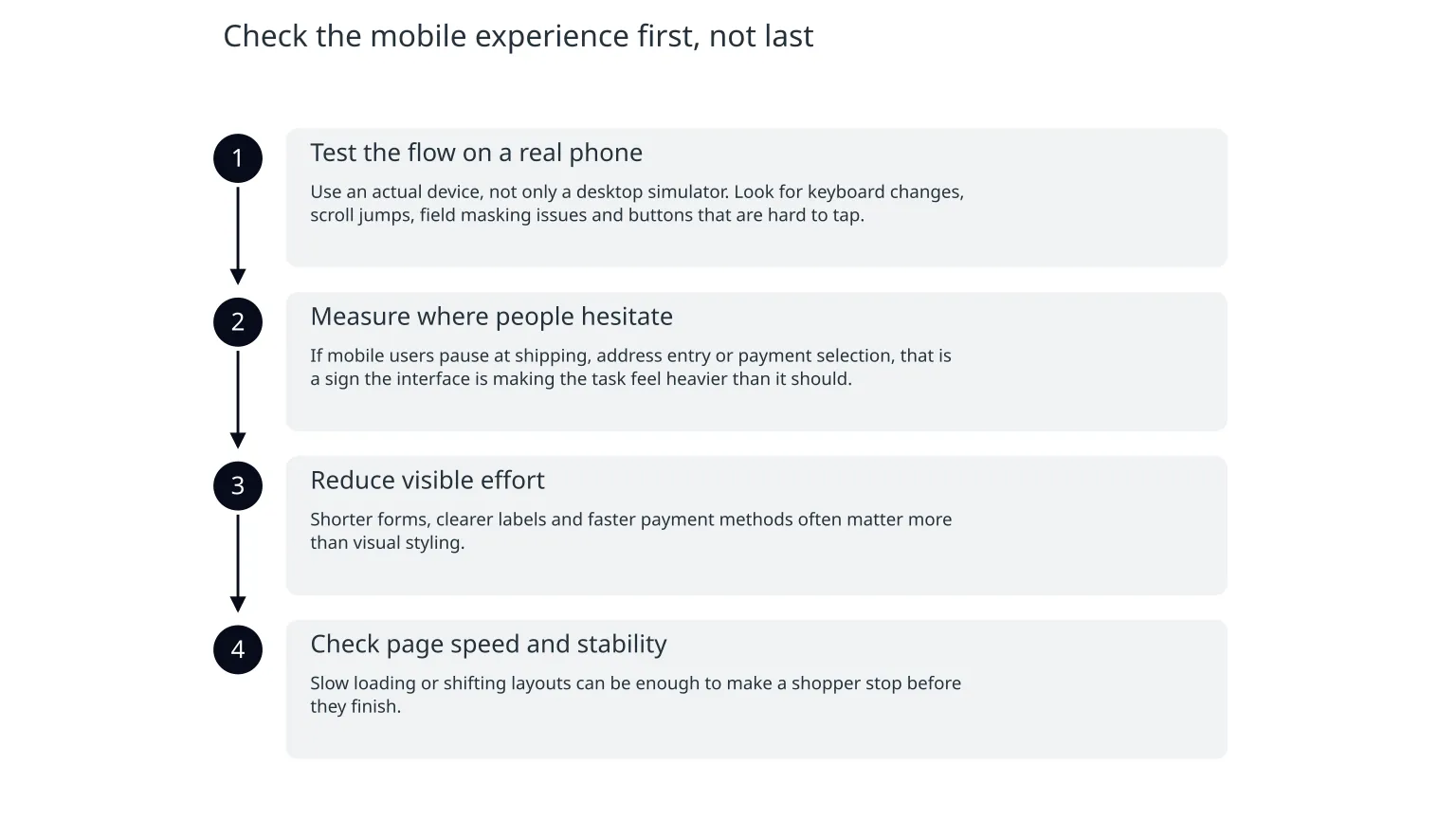
If most of your traffic is mobile, mobile checkout is not a smaller version of desktop checkout. It is the main experience. Small layouts make extra fields, cramped selectors and awkward payment steps much more visible. Baymard’s research notes that unnecessary fields are especially painful on mobile.
- 1
Test the flow on a real phone
Use an actual device, not only a desktop simulator. Look for keyboard changes, scroll jumps, field masking issues and buttons that are hard to tap.
- 2
Measure where people hesitate
If mobile users pause at shipping, address entry or payment selection, that is a sign the interface is making the task feel heavier than it should.
- 3
Reduce visible effort
Shorter forms, clearer labels and faster payment methods often matter more than visual styling.
- 4
Check page speed and stability
Slow loading or shifting layouts can be enough to make a shopper stop before they finish.
Use evidence to decide what to change first
A friction-first checklist only works if you pair it with evidence. You do not need a complicated analytics programme to begin. You do need enough visibility to see where people drop off, which devices struggle most and whether a change helped or hurt.
| Check | What it tells you | Why it matters |
|---|---|---|
| Step-by-step abandonment | Where shoppers stop | Shows the exact point of friction |
| Device split | Whether mobile is the main issue | Prevents desktop assumptions from driving the fix |
| Form field completion | Which inputs slow users down | Helps remove or simplify the worst offenders |
| Payment success rate | Whether payment choice or errors are causing exits | Separates UX problems from technical failures |
| Delivery cost visibility | Whether late surprises are affecting trust | Highlights pricing confusion rather than product demand |
Baymard’s broader checkout research suggests there are many recurring improvements across forms, fulfilment selectors, address lookup and payment layout. That does not mean every store needs all of them. It means the likely answer is usually a small set of fixes, not one big overhaul.
What to fix first, in order
Highest priority
Remove avoidable form fields, clarify delivery costs early, and make mobile payment simple.
Lower priority
Full visual redesign, branding refresh or cosmetic layout changes that do not address a known drop-off point.
0 of 6 complete
When specialist support is useful
If you already know the problem is in checkout but cannot isolate the cause, a structured review can help. That is especially useful when analytics, UX, marketing and technical issues overlap. An outside team can often separate symptoms from root causes more quickly than an internal team juggling day-to-day trading work.
For some retailers, the next step is not a rebuild. It is a short audit that looks at form fields, payment steps, delivery costs, mobile usability and the order flow together. If the issue turns out to be broader than checkout, then a wider growth or product review may make sense. But the first move should still be evidence-led.
The practical takeaway
- Look for the smallest blockers before redesigning the whole funnel.
- Form fields, delivery costs, payment choice and mobile usability are the most likely friction points to inspect first.
- Fix one issue, measure it, then move to the next.
- If the problem spans analytics, UX and implementation, a short expert review can save time and reduce guesswork.
Checkout optimisation works best when it is treated as a sequence of small, testable fixes rather than a single big launch. Start with the friction the shopper can feel, and you are more likely to improve conversion without adding unnecessary complexity.

About the author
Nixim Team, Product Engineering
Practical guidance from Nixim on building software, working with AI and running dependable cloud systems.