
Which friction points should ecommerce teams fix first before checkout?
A practical checklist for ecommerce founders and teams who want to reduce drop-off earlier in the journey, before checkout becomes the only thing they optimise.

On this page
Why firstWhat to fixHow to prioritiseExamplesMeasureRisksNext stepsIn short
- Start with the biggest points of confusion, not the prettiest page.
- Fix comparison, navigation and account friction before checkout-only tweaks.
- Use evidence from search, exits, support queries and session paths.
- Make one change at a time so you can tell what helped.
- If the journey is messy, checkout is often just where the problem becomes visible.
A lot of conversion loss happens before checkout, not just inside it. If shoppers cannot compare products easily, find their way around the site, or move through account steps without friction, they may leave long before the payment page appears.
That matters because checkout-only fixes can miss the real problem. Recent Baymard research points to friction across navigation, category pages and account/self-service flows, not just the final purchase step. The right first fix is usually the one that removes confusion early in the journey, not the one that looks busiest on a heatmap.
This checklist is for ecommerce founders, marketing leaders and operations teams who want a sensible way to prioritise the work before committing to a full redesign.
Why the earliest friction usually matters most
Baymard’s current research is a useful reminder that ecommerce journeys break down in several places before checkout. Their benchmark work highlights homepage and category-navigation problems, unclear intermediary category pages, and awkward account-menu paths that make product discovery and comparison harder than it should be.
That does not mean checkout is unimportant. It means checkout is often the last place where earlier friction becomes visible. If shoppers have already struggled to compare products, find relevant options or understand the path forward, a cleaner payment flow may not recover them.
The first friction points to check
0 of 7 complete
These checks matter because they map to common shopping behaviour. Baymard’s 2026 research touches on product discovery, sale-seeking behaviour, checkout friction and account expectations, which suggests the problem is usually broader than a single page template.
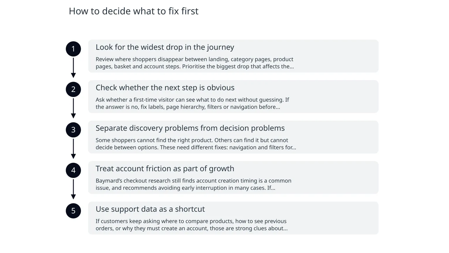
How to decide what to fix first
- 1
Look for the widest drop in the journey
Review where shoppers disappear between landing, category pages, product pages, basket and account steps. Prioritise the biggest drop that affects the most traffic, not the most visible complaint.
- 2
Check whether the next step is obvious
Ask whether a first-time visitor can see what to do next without guessing. If the answer is no, fix labels, page hierarchy, filters or navigation before adding more promotional content.
- 3
Separate discovery problems from decision problems
Some shoppers cannot find the right product. Others can find it but cannot decide between options. These need different fixes: navigation and filters for the first group, comparison and information clarity for the second.
- 4
Treat account friction as part of growth
Baymard’s checkout research still finds account creation timing is a common issue, and recommends avoiding early interruption in many cases. If registration appears before trust or purchase intent is established, it can become a preventable exit point.
- 5
Use support data as a shortcut
If customers keep asking where to compare products, how to see previous orders, or why they must create an account, those are strong clues about friction that should not be ignored.
Illustrative examples of sensible fixes
If comparison is weak
Add clearer filters, side-by-side product comparison and plain-language category summaries so shoppers can narrow choices faster.
If account flow is weak
Delay account creation until the confirmation step where possible, or allow guest checkout if that better fits the buying context.
If navigation is weak
Rework the main menu and category structure so common buying paths are obvious, not hidden behind jargon or internal labels.
If path clarity is weak
Use clearer breadcrumbs, category summaries and related-product cues so shoppers understand where they are and what to do next.
Illustrative example: a retailer with many similar products may find that conversion improves more from better comparison tools and simpler category pages than from a redesigned payment form. Another store may discover the main issue is not checkout at all, but a forced account step that interrupts a purchase before intent is confirmed. These are examples, not universal fixes.
How to know whether a fix is working
- Track the path from landing page to category page to product page, not only checkout completion.
- Watch for fewer exits after category browsing and fewer back-and-forth loops between similar products.
- Check whether account-related drop-off falls after changing registration timing or reducing required fields.
- Compare support tickets and on-site search queries before and after the change.
- Review whether shoppers reach a product decision faster, even if overall traffic stays the same.
Baymard’s navigation benchmark and broader ecommerce UX research support the idea that small journey improvements can matter when they remove repeated friction points. The goal is not to chase a vanity metric. It is to make the path clearer and less effortful for the shopper.
| Friction point | What to inspect | Useful signal | Typical first fix |
|---|---|---|---|
| Navigation | Homepage menu, category labels, breadcrumbs | Repeated exits before product pages | Simplify labels and restructure paths |
| Comparison | Filters, product listings, product detail pages | Many similar-item views with no action | Add comparison and clearer category guidance |
| Account creation | Sign-up timing, required fields, guest checkout | Drop-off at login or registration | Delay account creation or reduce interruption |
| Path clarity | User journey between pages | Backtracking and confusion in session recordings | Add clearer next steps and page hierarchy |
Common mistakes to avoid
0 of 5 complete
A sensible next step for the next two weeks
0 of 6 complete
If you need help scoping the work, a practical delivery partner can separate discovery from build, help you decide what to test first, and keep the scope narrow enough to learn something useful. That is often more valuable than starting with a full redesign plan.
The main lesson is simple: fix the part of the journey that makes shopping feel confusing before you optimise the final step. In many ecommerce sites, the first conversion gain comes from making the path clearer, not from making checkout cleverer.

About the author
Nixim Team, Product Engineering
Practical guidance from Nixim on building software, working with AI and running dependable cloud systems.